Accessibility
Cairn is built to work well for everyone. Here is what we support today on iPhone and Apple Watch, and how to reach us if something is not working for you.
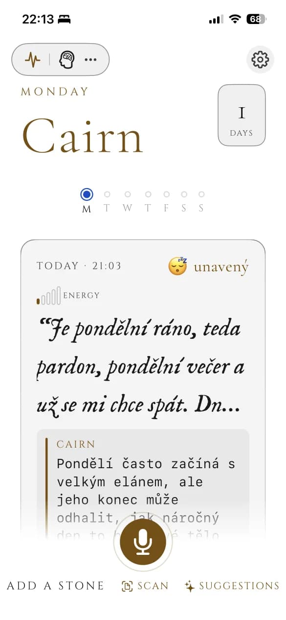
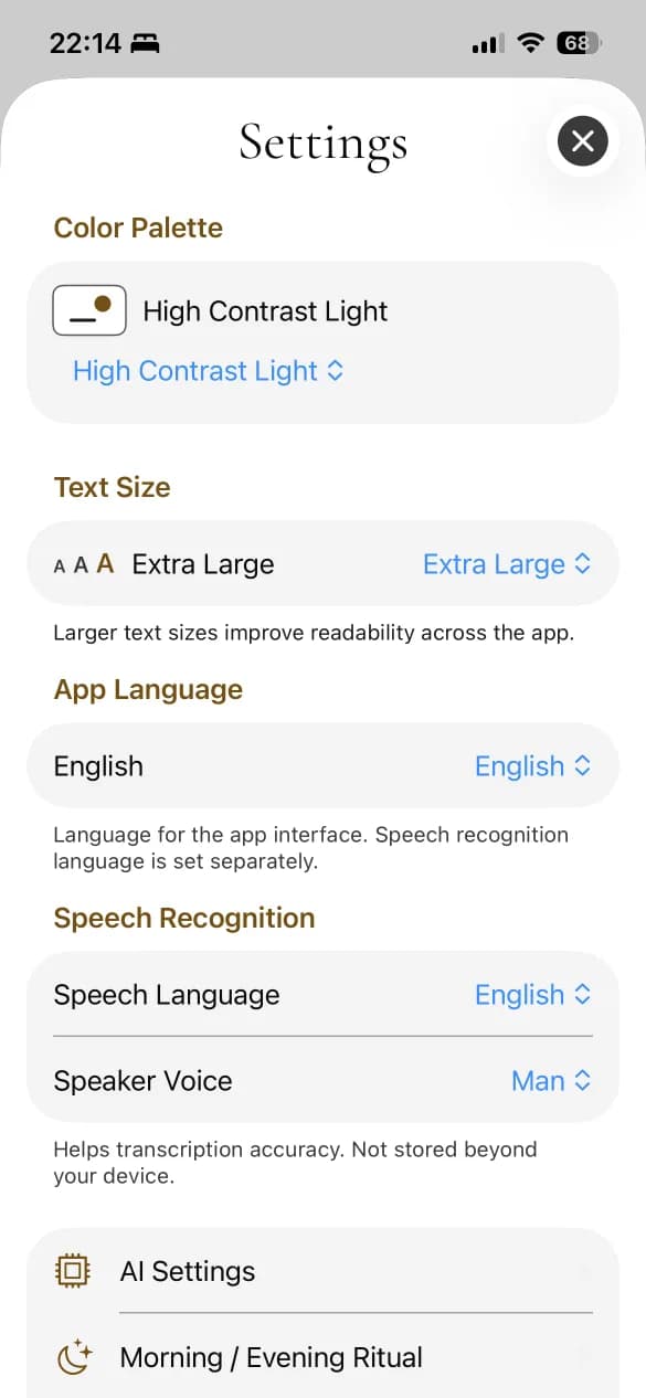
Light — High Contrast Light palette
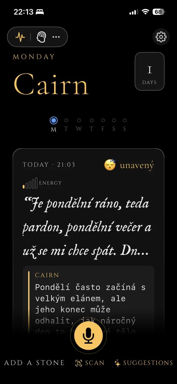
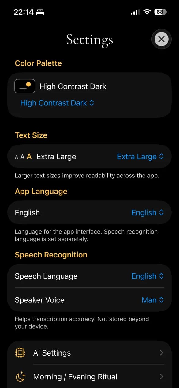
Dark — High Contrast Dark palette
Support on iPhone
Larger Text
Cairn respects your iPhone’s Dynamic Type setting, and the app has its own adjustable text-size control in Settings for entries, reports, and insights.
Dark Interface
A dark palette by default (Amber Dusk), alongside a light palette and the dedicated high-contrast palettes below.
Differentiate Without Color Alone
Mood and energy are always paired with an emoji, a word, and a bar — never color alone.
Sufficient Contrast
Ink and Daylight are dedicated AAA-contrast palettes, tuned for low vision and bright-light readability.
Support on Apple Watch
Larger Text
Dynamic Type support carries over to complications and glances on the watch face.
Dark Interface
The same palettes are available on Apple Watch.
Sufficient Contrast
The Ink and Daylight AAA-contrast palettes are available on Apple Watch too.
Something not working for you?
If you use assistive technology and run into a rough edge, tell us — we read every message. support@cairnjournal.com